the ivy day campClient type: Education
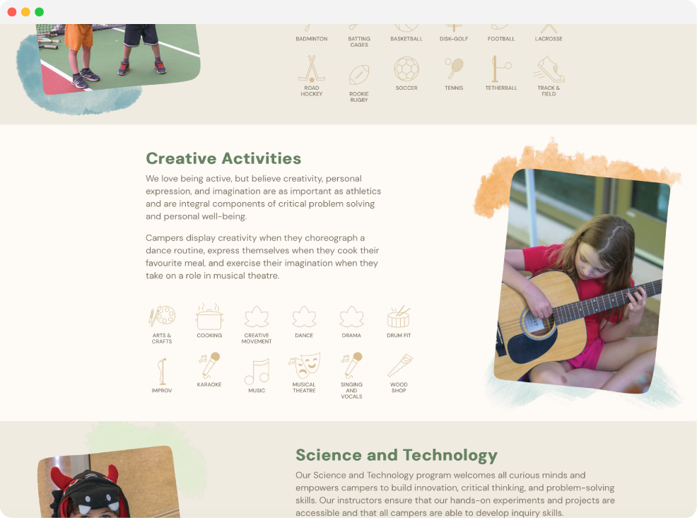
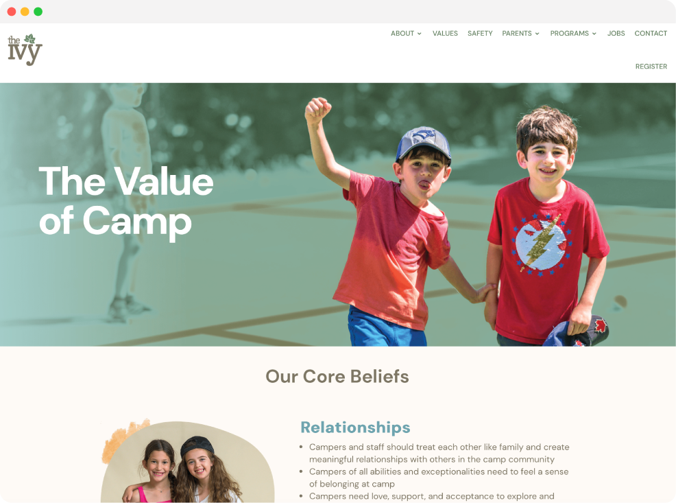
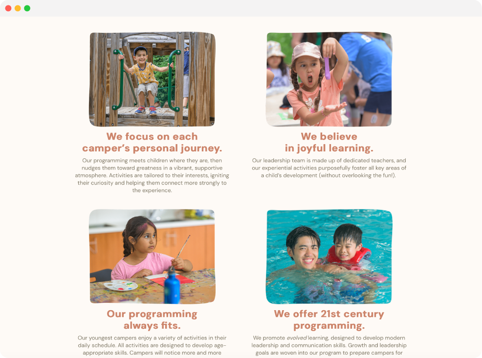
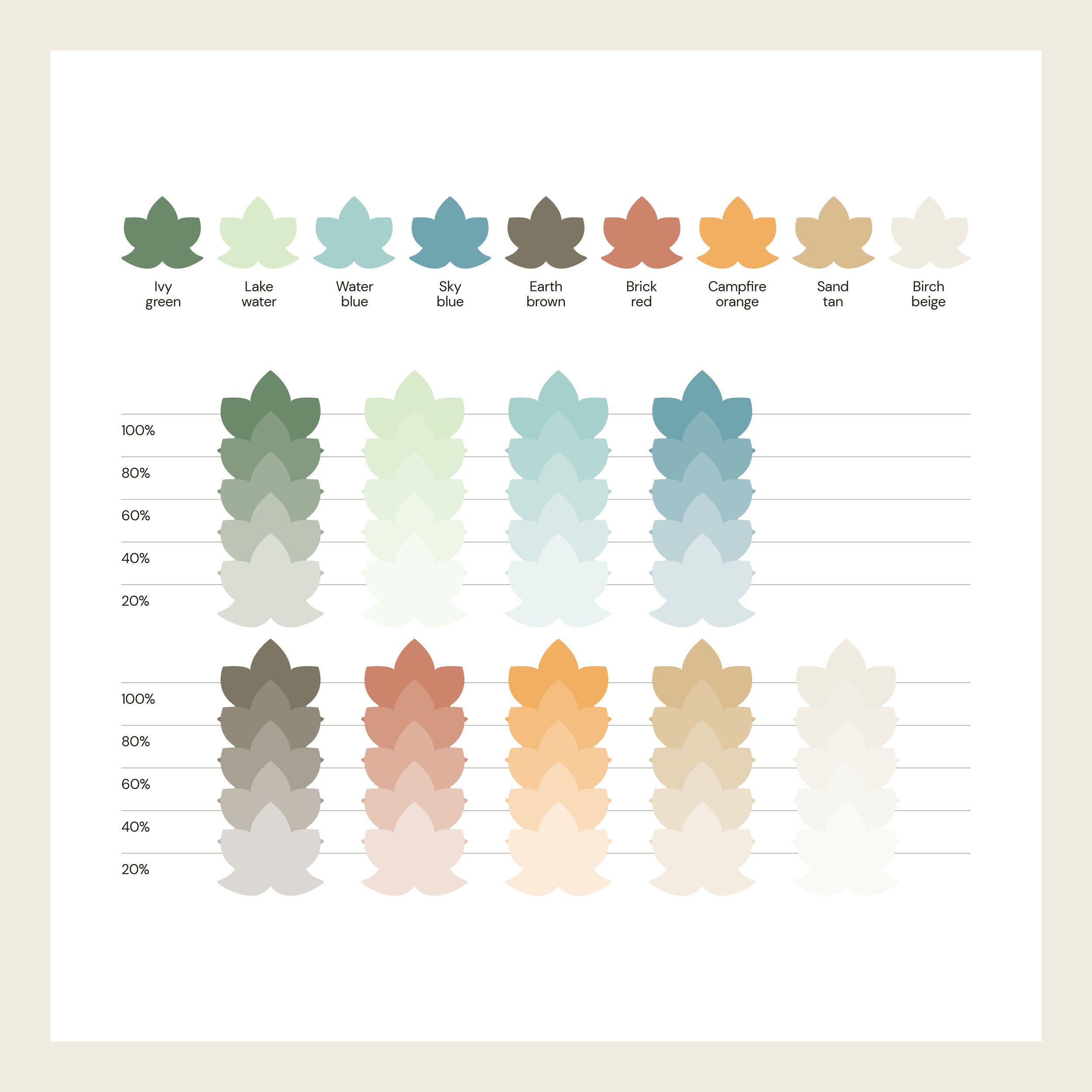
Inspired by its lush green surroundings, the branding is made up of earthy colours, round & friendly fonts, and illustrated elements to appeal to the campers, and be welcoming to new and prospective families.
Art direction & design: Laura Weatherston
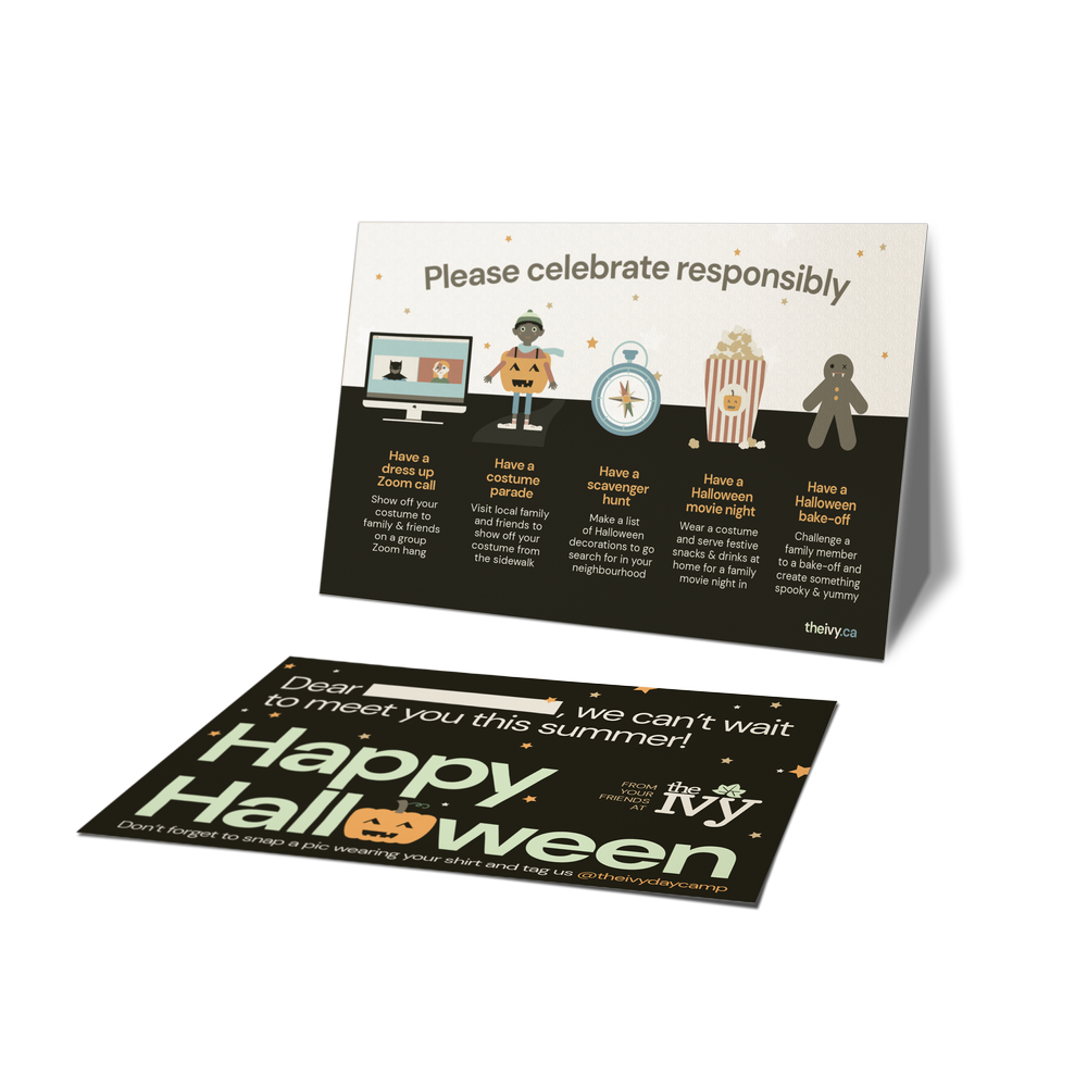
Work includes: camper newsletters, staff manuals, parent handbooks, social graphics, signage, advertising, postcards, merchandise, worksheets, menus and web design.


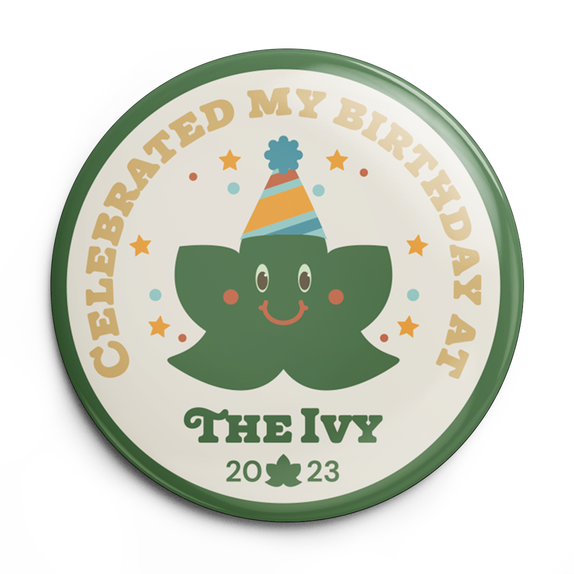
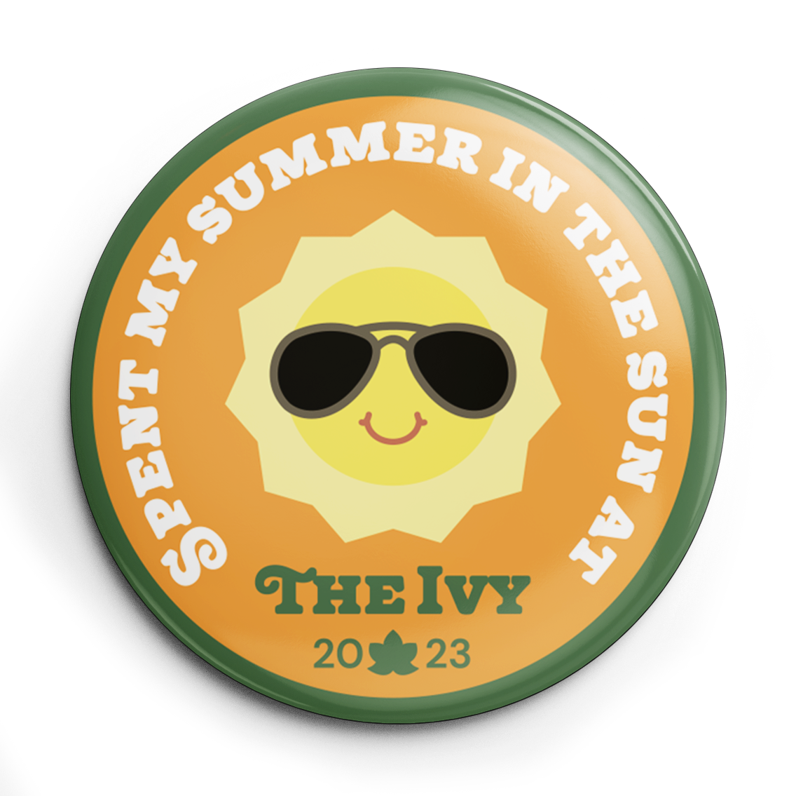
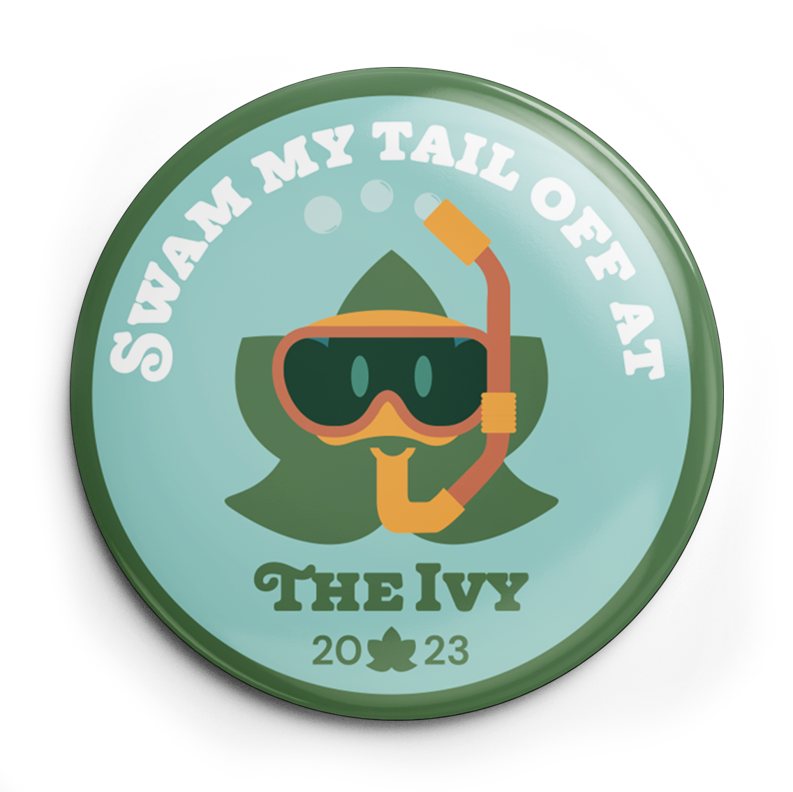
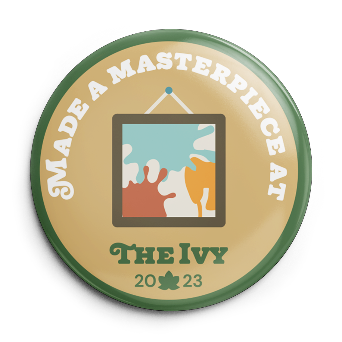
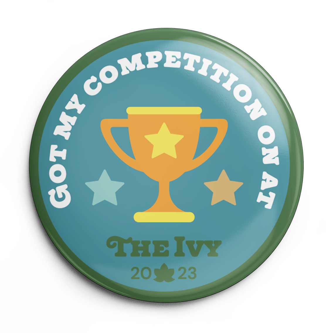
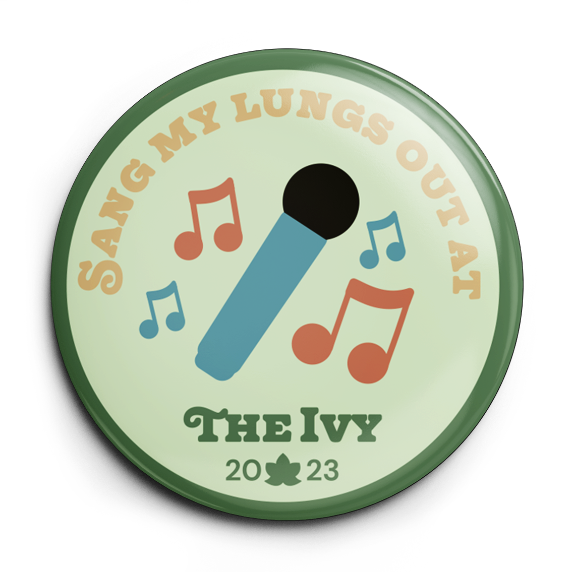
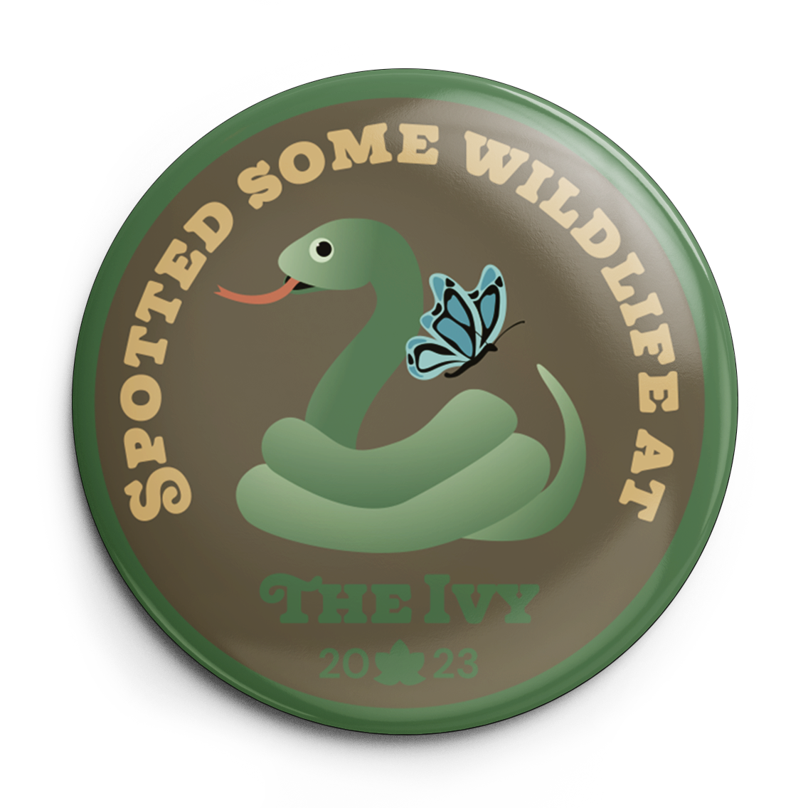
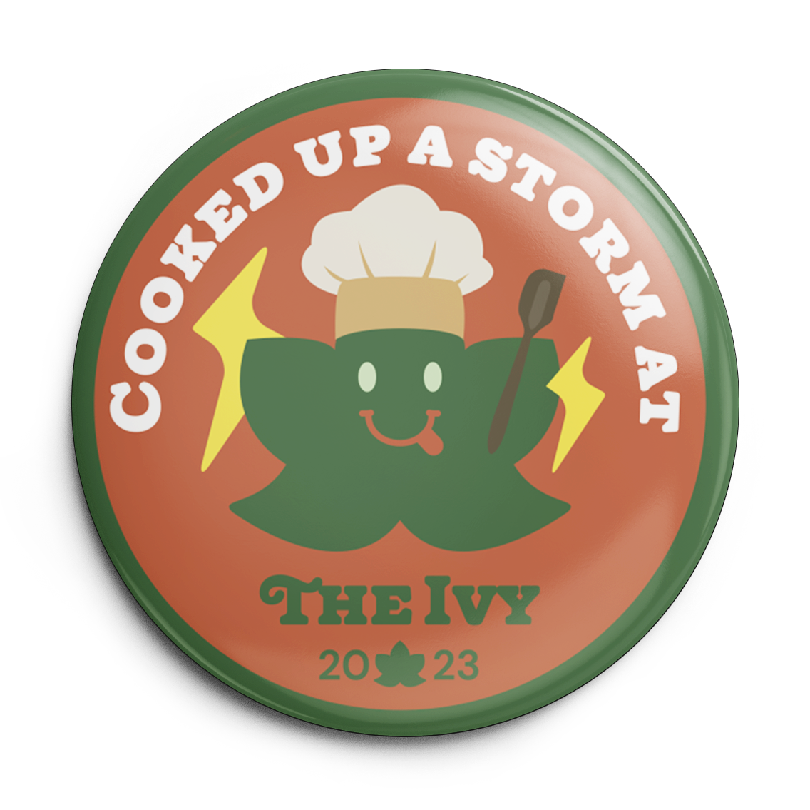
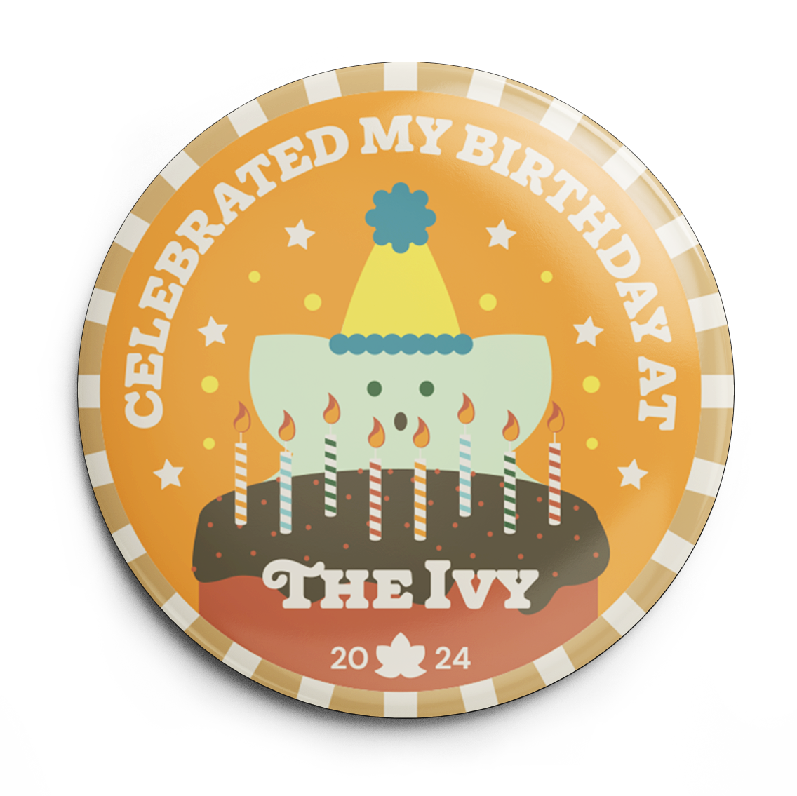
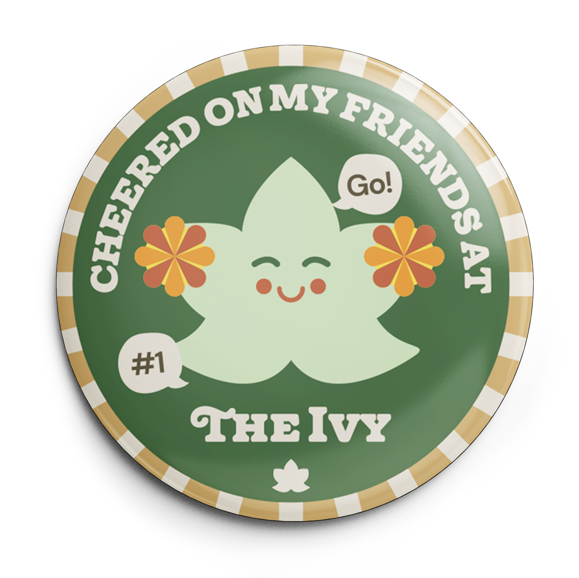
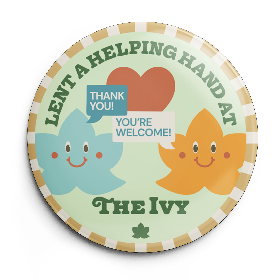
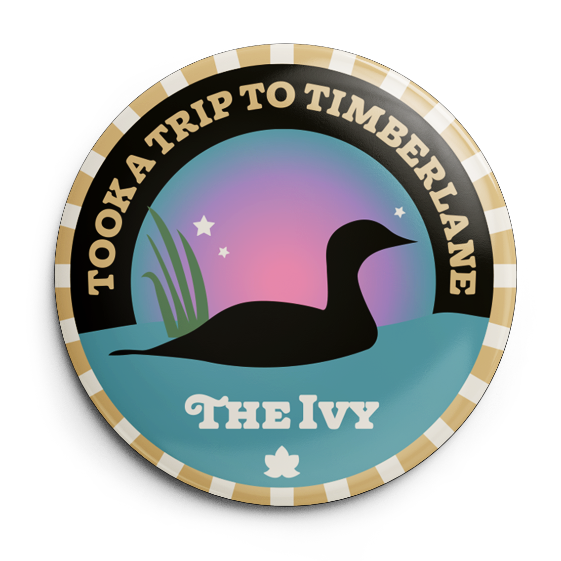
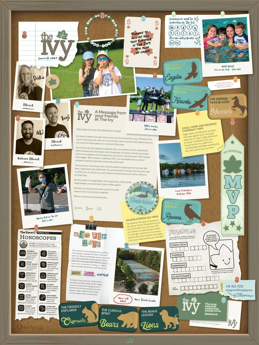
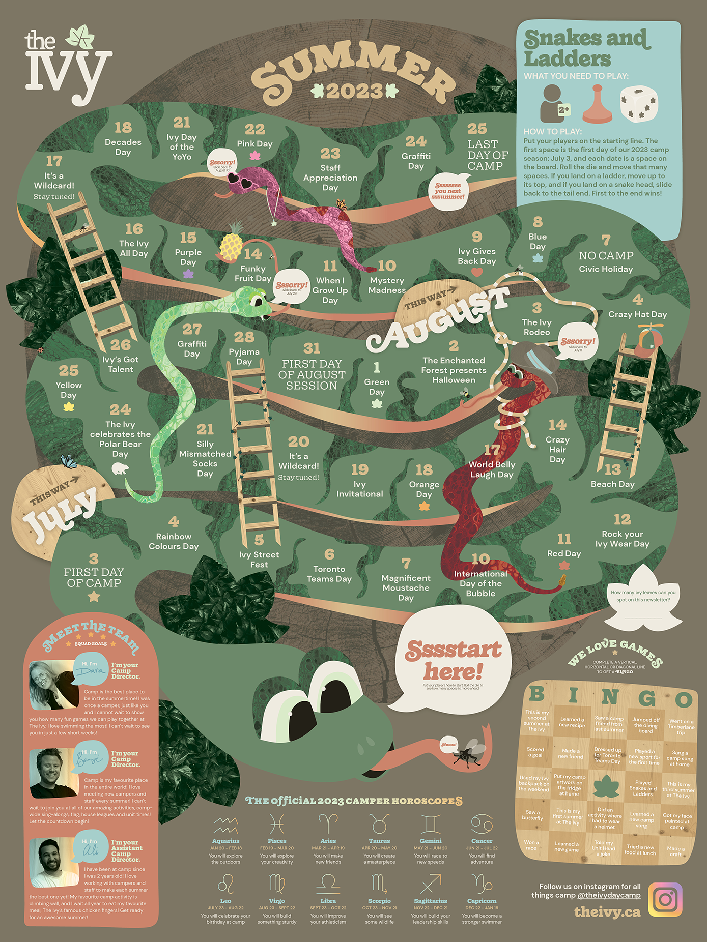
The standout collateral for every camp year are the camper newsletter and the At The Ivy buttons. The camper newsletter (above) kicks off the camp season. It’s a double-sided 18x24” poster that campers can put on their wall at home to keep track of the daily camp events, the menu, read their camper horoscope and play a game or two. Every year I’ve come up with a new concept to keep the campers excited to receive this newsletter that’s created specifically for them. 2025: bulletin board collage-style to celebrate the camp’s fifth summer, 2024: calendar in comic strip style, 2023: calendar in a snakes and ladders game format, and 2022: the front of the poster had a picture they could colour in themselves. / The At The Ivy buttons are a series of buttons they collect throughout the summer to celebrate various events and things that make The Ivy so special.
